Skin at Peace
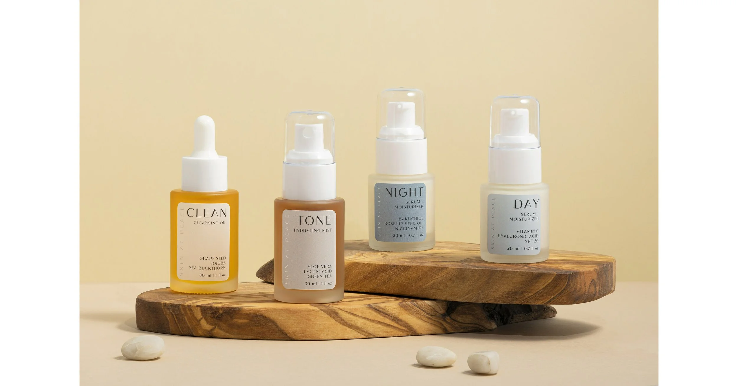
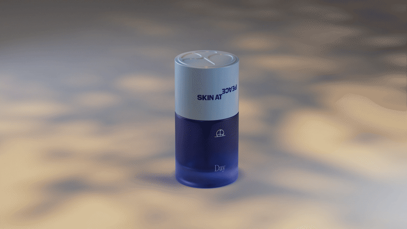
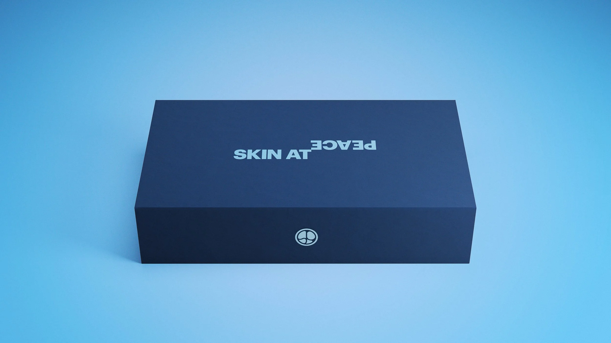
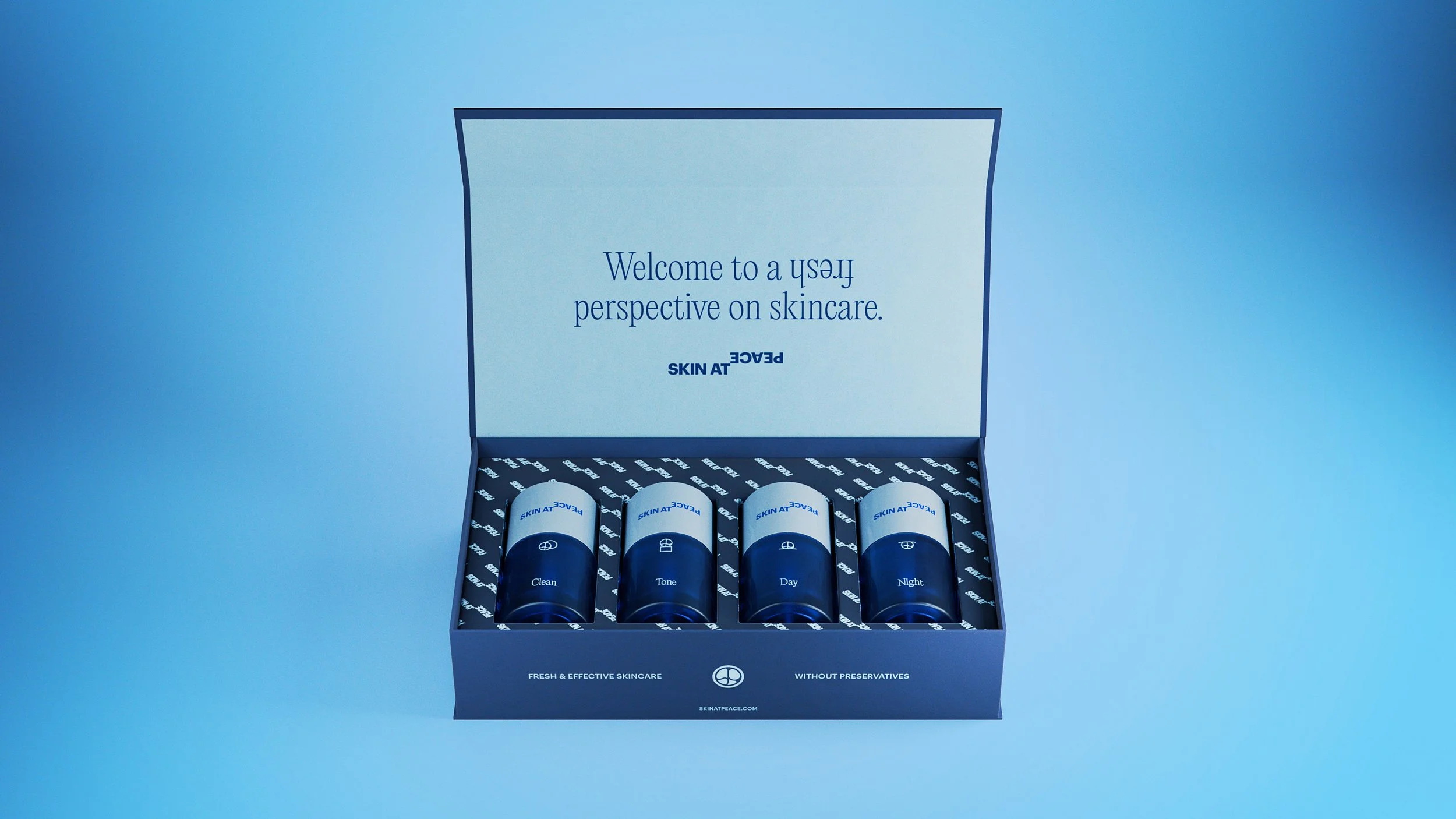
Skin at Peace was born where radical transparency meets daily ritual. What began as pregnancy-safe skincare evolved into a movement for everyone, driven by a belief that fresh, preservative-free formulas work better than forever. With zero toxins, no endocrine disruptors, and a focus on clarity over chemicals, the brand set out to challenge how we care for our skin. For the rebrand, we flipped the word “peace” upside down, a reminder that sometimes a small change in perspective can lead to a healthier routine. The result is an identity that feels calm, confident, and committed to keeping your skin at peace.
-
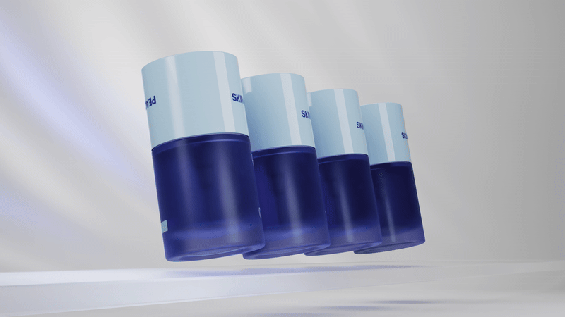
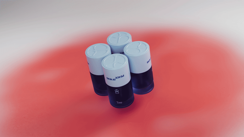
We focused on cleaning up the design language while making it feel more confident. Simple color blocking and moments of perspective changes demonstrate the brand’s cleanliness and also it’s disruptive nature.
-
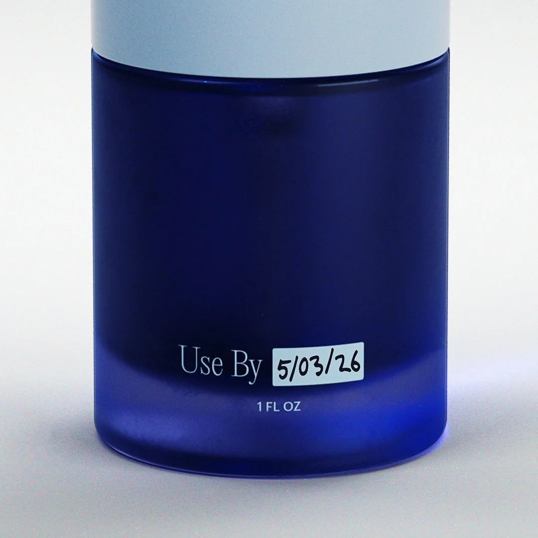
For the packaging, we designed a bottle with a flush lid to maintain a clean and uniform shape, allowing users to literally flip it upside down. To evoke a sense of peace, we used calming blue tones that convey balance and optimism. The simplicity of the design and the harmony across the system create a look you would actually want to show off in a selfie.

AFTER
BEFORE
BEFORE

AFTER


Design: Me & Madison Schneider
Creative/Design Director: Me
3D and Animation: Alex Trimpe
Made with the lovely people at Bullish